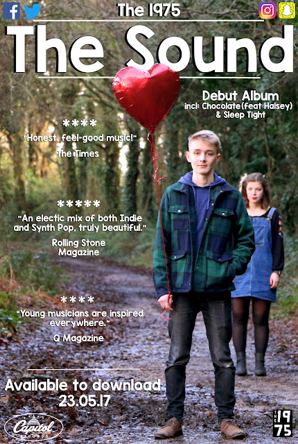
After gaining audience feedback for my promotional poster, I edited it to conform to their ideas in most aspects however there were parts or sections that I did not agree with. So I went against social conventions and decided to chose some design aspects for myself.
Here is my new and improved poster. I followed the audience's advice and moved the position of the balloon, because I couldn't move the balloon itself I moved the text up, this caused me to make the band name slightly smaller as well as the social media icons, I feel this has actually improved them because they look more proportioned. I added a shadow to the text so that the white font can be read easier, the "Honest, feel-good music!" text that Livia pointed out was hard to read is still slightly difficult however it is a lot better then what it was before because of the shadow. A couple people said that the poster looked more like a short-film poster so I added "Debut Album incl: Chocolate (feat Halsey) & Sleep Tight" so that it was clear it was for music and not a film. I put the text next to the balloon which is the main feature point of the eye so it should be one of the first aspects the viewer sees.

No comments:
Post a Comment